PropoMucil
Overview
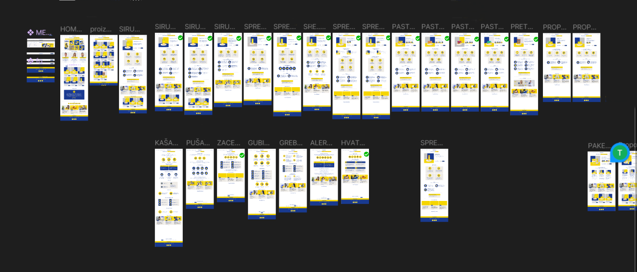
PropoMucil is a pharmaceutical e-commerce and educational website designed for users seeking effective solutions for respiratory issues. The primary goal of the website is to educate users about respiratory problems and available treatments, while the secondary goal is to facilitate online purchases of related products.
- 5 months
- Web developer & UX Strategist
- Figma & WordPress
Challenges Before the Redesign
Before the redesign, the website functioned as a standard e-commerce platform with a conventional product display. The main challenges included:
A limited educational aspect, reducing users ability to make well-informed purchasing decisions.
Users had to read each product description individually to find a suitable solution for their problem.
Work Process and Solution Implementation
To address these issues, the following steps were taken:
Research and Consultations
The team conducted an in-depth analysis of user needs in collaboration with the brand manager.
Product Categorization
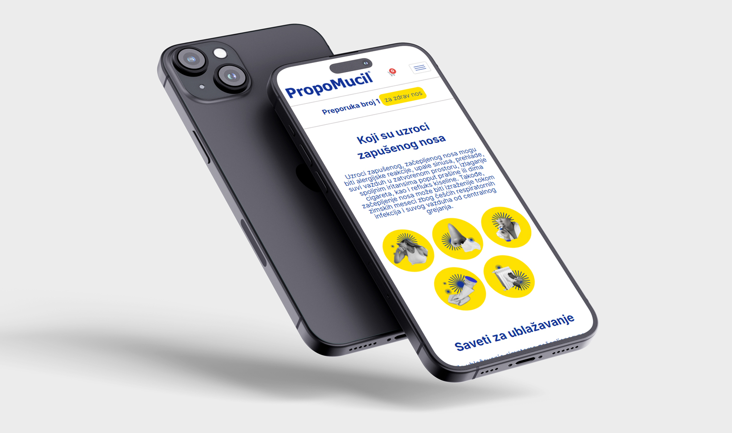
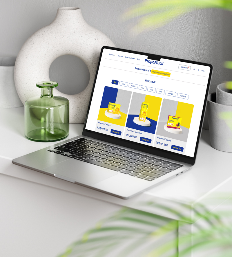
Instead of solely displaying products in a standard shop format, they were categorized based on symptoms such as colds, allergies, and difficulty in coughing up mucus.
Highlighting Expert and Doctor-Approved Content
To enhance brand credibility, expert articles and doctor-approved advice were integrated. This not only provides valuable information to users but also builds trust in the brand as a reliable source of health-related information.
Educational Content
Educational articles were created to inform users about symptoms and recommend appropriate products.
User Experience Optimization
Navigation improvements were made to help users quickly find the information they need.
Design
A new website layout was implemented with a focus on visual appeal and intuitive navigation.
Development
The project was developed using WordPress CMS, WooCommerce, PHP and JavaScript to ensure flexibility and tailored functionality.
Results After Implementation
Following the introduction of new functionalities, the following results were observed:
Reduced time required for users to find the right product.
Increased user engagement through educational content-users spend more time on the website.
Improved brand recognition thanks to visual enhancements.
Conclusion and Future Steps
The implementation of an educational approach made navigation easier and product selection faster, leading to an improved user experience and increased sales.
Future Steps for Further Website Improvement:
- Homepage revision to strengthen the sales focus.
- Implementation of sales banners if a more aggressive sales strategy is adopted.
- Further enhancement of educational content to boost user engagement.
- Development of an interactive quiz to help users determine the right product based on their symptoms.
- Implementation of a lead magnet strategy – plans include creating a free guide, discount coupons, or exclusive educational materials that users can download in exchange for their email or Viber contact.
- Email and Viber campaigns to build long-term relationships with users, provide valuable information, and encourage repeat purchases.
Key Benefits:
Product recommendations based on symptoms
Stronger visual brand recognition.
Increased sales through a combination of education and e-commerce.
Higher user interaction via quizzes, email, and Viber campaigns.
Enhanced user trust through expert medical advice